
Exam Scores by Section
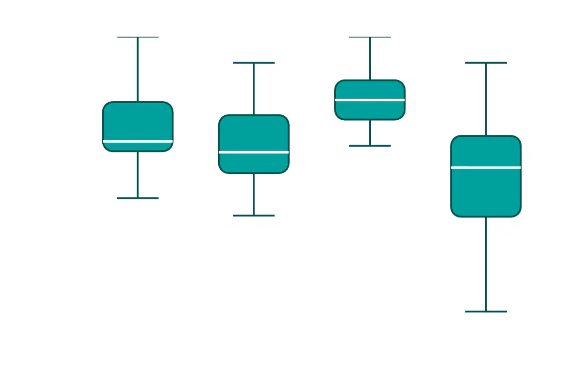
Distribution of exam scores across four lab sections, showing medians, quartiles, and outliers.
A box plot, popularized by John Tukey in his 1977 book Exploratory Data Analysis, compresses a numeric distribution into five summary statistics: minimum, lower quartile, median, upper quartile, and maximum, with possible outliers drawn separately. Side-by-side box plots make it easy to compare distributions across groups without losing information about spread or skew — a particular strength when group sizes differ.
The chart compares four synthetic lab sections, each sampled from a different mean and standard deviation and clipped to the 0 -100 score range. The y-axis is focused from 40 to 100 to keep the relevant spread readable. Differences in median height show section-level performance, while box and whisker lengths show how tightly or widely each section's scores are distributed — an instructional pattern that mirrors what a real teaching team would see when comparing across recitations or instructors.
JavaScript is required to view the interactive plot.