
Sample Price Series
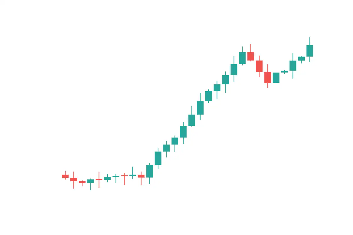
Open-high-low-close data for fictional ticker TYCH over 30 trading days, showing a breakout from consolidation.
A candlestick chart compresses four price values for each session — open, high, low, and close — into a single visual unit. The body shows the open-to-close move and is colored to indicate direction (up or down), while the wicks above and below show the high and low of the session. The format originated in 18th-century Japan among rice merchants and was popularized in Western finance by Steve Nison in the 1990s. Candlesticks remain the dominant chart style for technical analysis of equities, futures, and currencies.
The chart shows synthetic OHLC data for a fictional ticker, TYCH, over 30 trading days. The simulated price action moves through a sequence of common phases: a consolidation range, a breakout to the upside, a sustained uptrend, a short pullback, and a resumption of the trend. The body fills and wick lengths make day-by-day momentum and intraday range easy to read at a glance, providing a compact reference image for what a clean trending market looks like in candlestick form.
JavaScript is required to view the interactive plot.